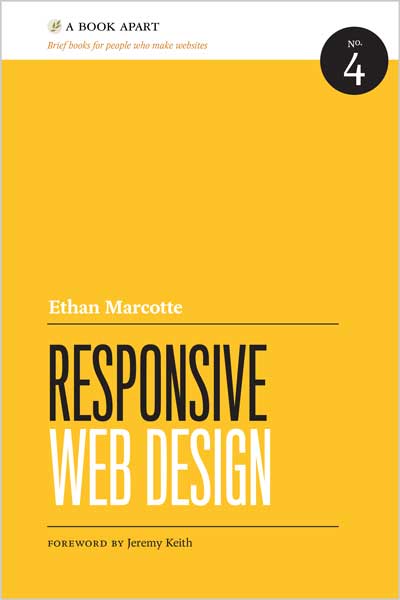
From mobile browsers to netbooks and tablets, users are visiting your sites from an increasing array of devices and browsers. Are your designs ready? Learn how to think beyond the desktop and craft beautiful designs that anticipate and respond to your users’ needs. Ethan Marcotte will explore CSS techniques and design principles, including fluid grids, flexible images, and media queries, demonstrating how you can deliver a quality experience to your users no matter how large (or small) their display.
Table of Contents
Chapter 1: Our Responsive Web
Chapter 2: The Flexible Grid
Chapter 3: Flexible Images
Chapter 4: Media Queries
Chapter 5: Becoming Responsive
About the Author
Ethan Marcotte (http://ethanmarcotte.com) is a versatile designer/developer whose work demonstrates a passion for the intersection of quality code and compelling design. A resident of Cambridge, Massachusetts, Ethan is fortunate to have worked with such clients as New York Magazine, Stanford University, the Sundance Film Festival, and the W3C. More fun facts: Ethan has a blog (http://unstoppablerobotninja.com), and blathers incessantly on Twitter (@beep). Also, he is tall. Ethan is a contributing author and technical editor at A List Apart, the magazine for people who make websites. He is also a popular educator, and has been a featured speaker at An Event Apart, the SXSW Interactive Festival, Future of Web Design, and AIGA’s In Control conference. An experienced author, Ethan collaborated with Happy Cog founder Jeffrey Zeldman on the third edition of Designing with Web Standards (New Riders, 2009), the classic title that sits on every savvy designer’s bookshelf. Additionally, he acted as a contributing author to Handcrafted CSS (New Riders, 2009), Web Standards Creativity (friends of ED, 2007) and Professional CSS (Wrox, 2005). Responsive Web Design is Ethan’s first solo book, and he’s pretty darn excited about that. He’d like to thank you for reading it.






نقد و بررسیها
هنوز بررسیای ثبت نشده است.